Role: Designer
Dates: 2016 - 2017
Dates: 2016 - 2017
Visual design
Branding
Branding
Equinox Digital Platform Redesign
Forging a cohesive identity that allowed members to seamlessly traverse between digital and physical

Challenge
Equinox is a luxury fitness company headquarted in New York City whose “clubs” are located in major cities across the United States and abroad. It caters to a customer base willing to pay premium for ultra-modern facilities, high-end services, and first-class trainers. Popularly known for its provocative advertising campaigns, Equinox isn’t shy about proclaiming its brand’s edginess and elitism.
Equinox online, however, was anything but edgy or luxurious. Their digital platform was oddly fragmented into three standalone sites: one site for logged in members, one site for visitors and nonmembers, and one site for their public blog. Other than the Equinox logo, there were no other aesthetic or functional elements unifying the three types of experiences. Neither of the sites looked like they’ve been updated in decades. In 2014, Equinox approached R/GA to help them resolve the digital arm of their brand identity crisis. Our challenge was this: How can we align Equinox’ online presence with who they are and how they want others to see them?
Solution
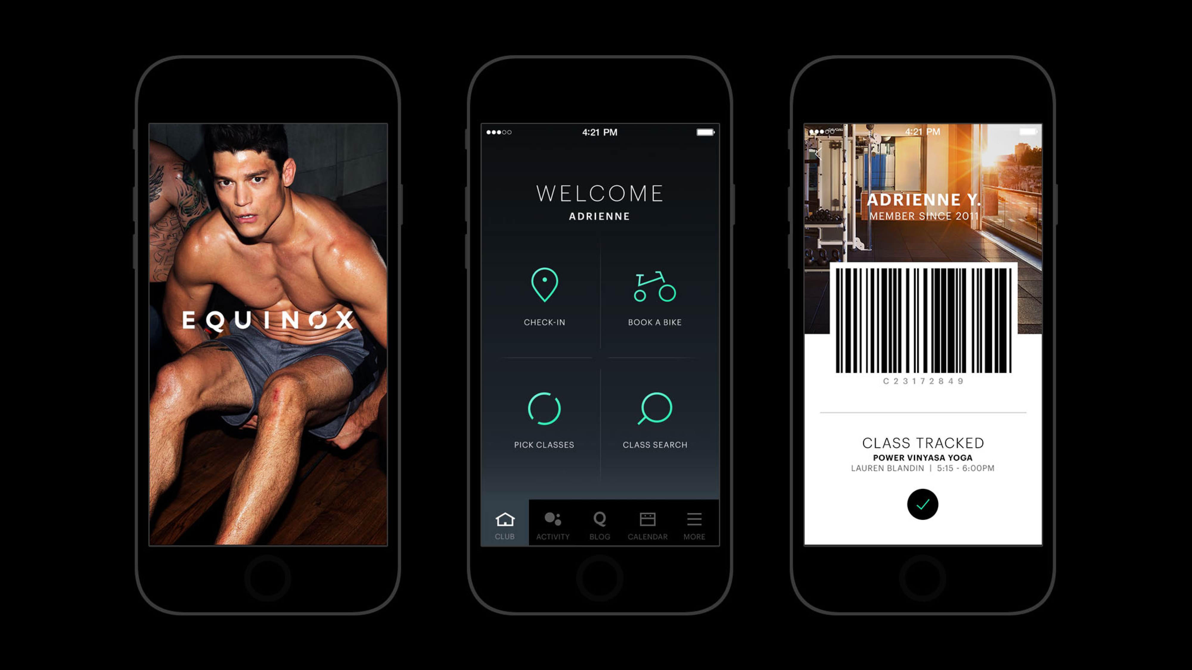
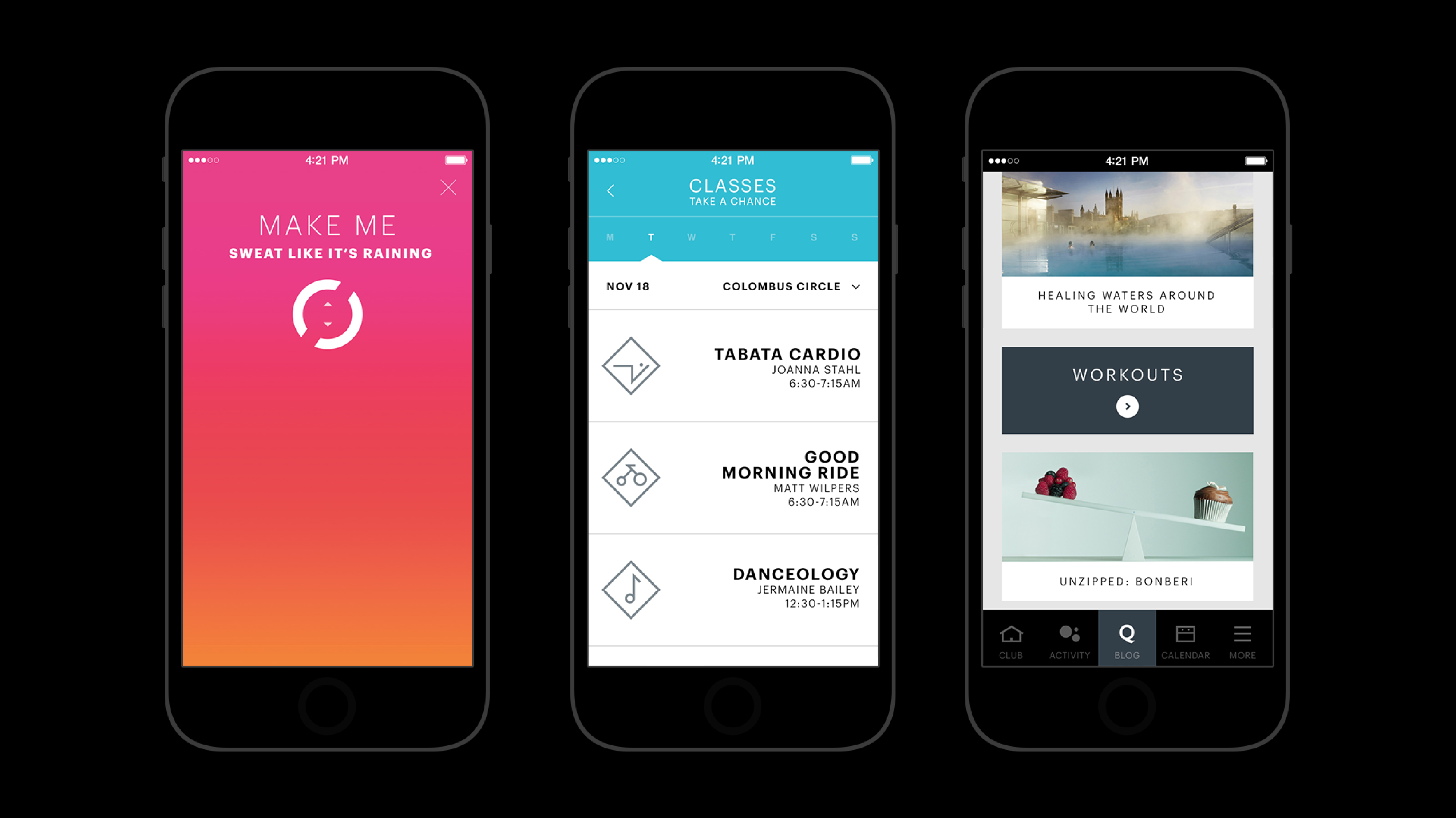
We started the project by consolidating the three disparate web platforms into one simplified and cohesive web experience for members and nonmembers alike. We clarified and enriched their visual identity and applied it consistently across their web and mobile platforms. The Equinox mobile app for members, which was threadbare in its features and functionality, got a much needed UX/UI makeover that elevated it to a quality level that matched customers’ experience in the physical gym. The improvements we made to the website and the mobile app include a simplified information architecture to aid navigability, a visual system overhaul, data visualizations to improve activity tracking, a playful discover feature to keep members engaged, and a brand new icon system representing every category of fitness class offered.
Team
Creative direction
Ryan Scott Tandy, John White, Gene Perelson
Design
Diana Frurip, Minah Kim, Jesse Wang
Technical director
Matt Jacobs
Front end
David Hitchings
Production
Doron Gura, Charles Dodson
Client
Equinox︎︎︎
Timeline
2014-2015
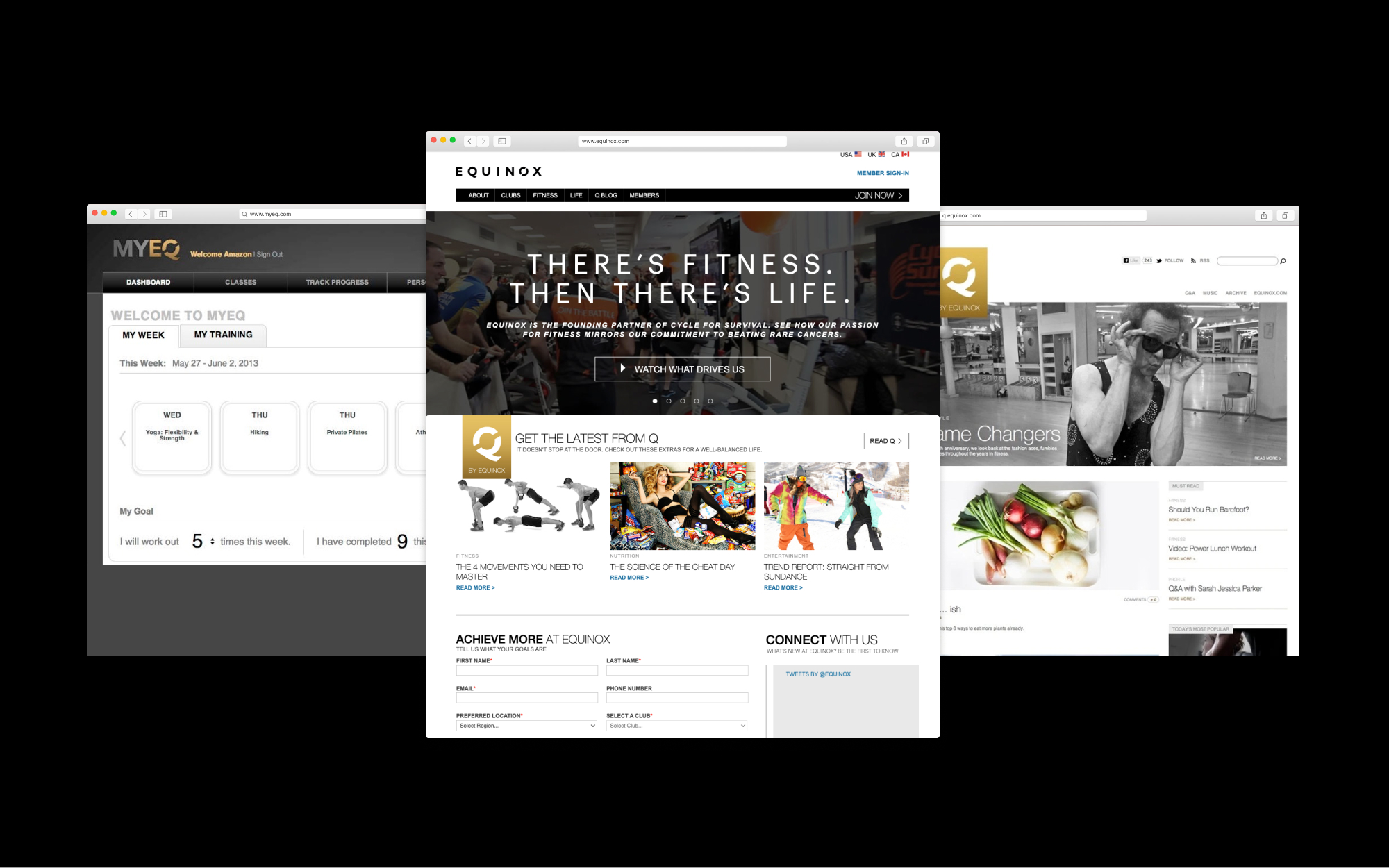
︎︎︎ BEFORE REDESIGN / There were three different Equinox experiences living on three separate sites, neither of which evoked – in either form or function – the attributes of luxury that Equinox wanted to embody. From left: MyEQ 2.0 app for members to schedule classes and track their activities (the mobile app equivalent received only a one-star review in the iTunes app store, the main site for content about membership, clubs, and fitness offerings, Equinox’ lifestyle, culture, fitness blog.
︎︎︎ The icon system representing Equinox’ fitness offerings was inspired by the sharp edges and stark simplicity of hobo codes and tribal symbols. We straddled the line between clarity and abstraction to maintain an air of enigma and exclusivity. The sentiment was this: only Equinox insiders – those with coveted memberships to the gym – were saavy enough to decipher the codes.
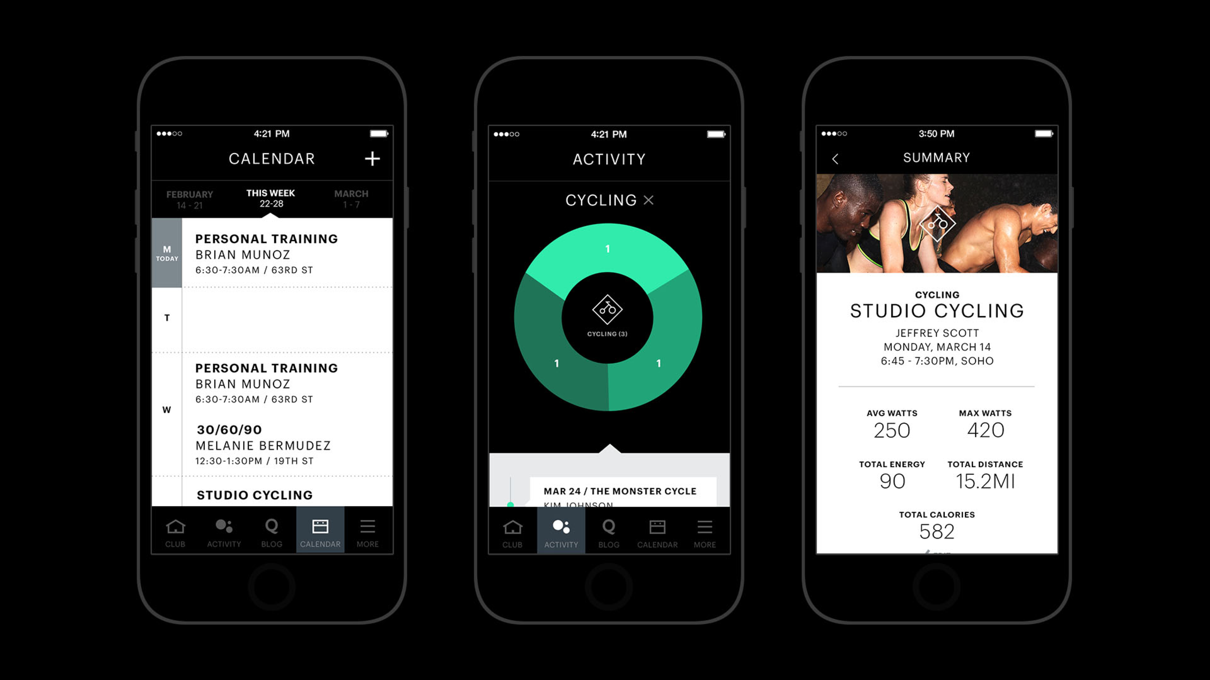
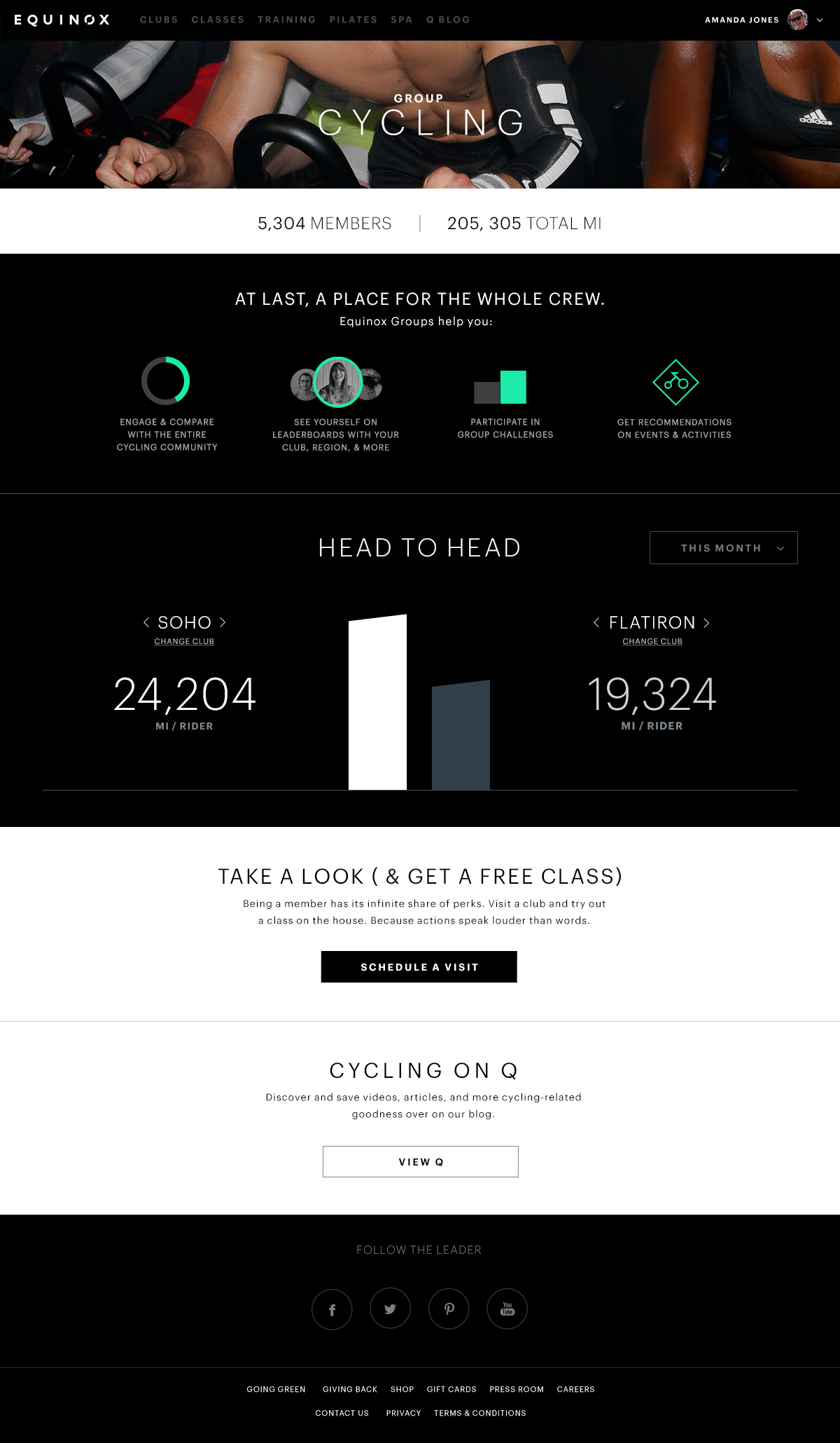
︎︎︎ Equinox web detail page for a group cycling class. Data is leveraged to promote camraderie, contribution and healthy competition among members.
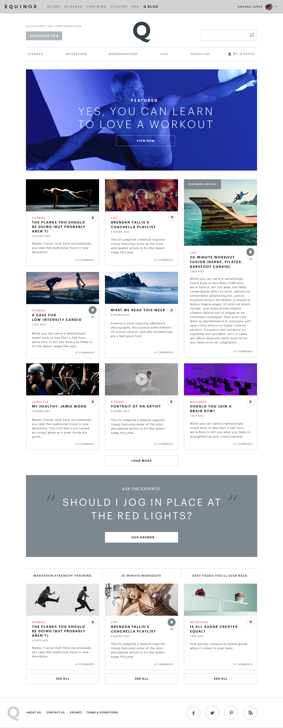
︎︎︎ For Equinox’ fitness and lifestyle blog, Q, we created a responsive site, simplified the layout and site structure for easier navigability, and updated the visual system for a more engaging experience. We also added a new content favoriting feature that allowed users to bookmark content within the site.